
B2B SaaS CRM web-based platform for youth mentoring non-profit organizations.
BCombs

ROLE
UX/UI Designer
TIMELINE
May 2023 - Jan 2024
TEAM
5 UX/UI Designers
Project Manager
SKILLS
Interaction Design
Visual Design
Design Systems
User Research
TOOLS
Figma
Lookback.io
Project Overview
B.combs provides a comprehensive solution to streamline processes for nonprofit organizations, particularly by automating tasks such as online applications.
With a projected revenue of $1,000,000 in its first-year post-launch, B.combs stands poised to revolutionize nonprofit operations. Currently, our client utilizes a basic MVP, effectively validating the concept through initial client engagements.
PROBLEM
Youth mentoring nonprofits lacked a centralized platform to share vital information such as Programs, Classes, and Events, hindering their ability to provide tailored services to their target audience.
While our client had developed a basic MVP with user authentication and scheduling features, BCombs required substantial enhancements to evolve into a robust CRM system. The platform needed critical components for effective relationship management, including comprehensive profile handling, a dynamic marketplace interface, and efficient resource allocation tools. Our mission was to bridge these functionality gaps, transforming the rudimentary MVP into a fully-fledged, user-centric solution that would empower these organizations to better serve youth through improved information sharing and resource management.
01
DISCOVERY
Reviewing Existing UX Research
To understand the current landscape, I reviewed the designs given to our team from the previous UX designers who worked on B.COMBS
1/ DASHBOARD
Use of bento boxes for organizing information
and emphasis on visually sharing data.
2/ NAVIGATION BAR
The navigation bar contained an extensive collection of tabs that lead to different sections of the CRM, also the collapsing function for simplicity.
3/ STYLE GUIDE
With the preference for the orange color palette, with secondary colors used sparingly as needed. The use of white space around the information.
4/ Components
The current MVP contained the essential foundations of a login flow, home screen, dashboard, style guide
The Goal
This stage focused on adding CRUD (Create, Read, Update, Delete) functionality for documenting resources and action steps and creating a marketplace for the platform
02
IDEATION
03
DESIGN
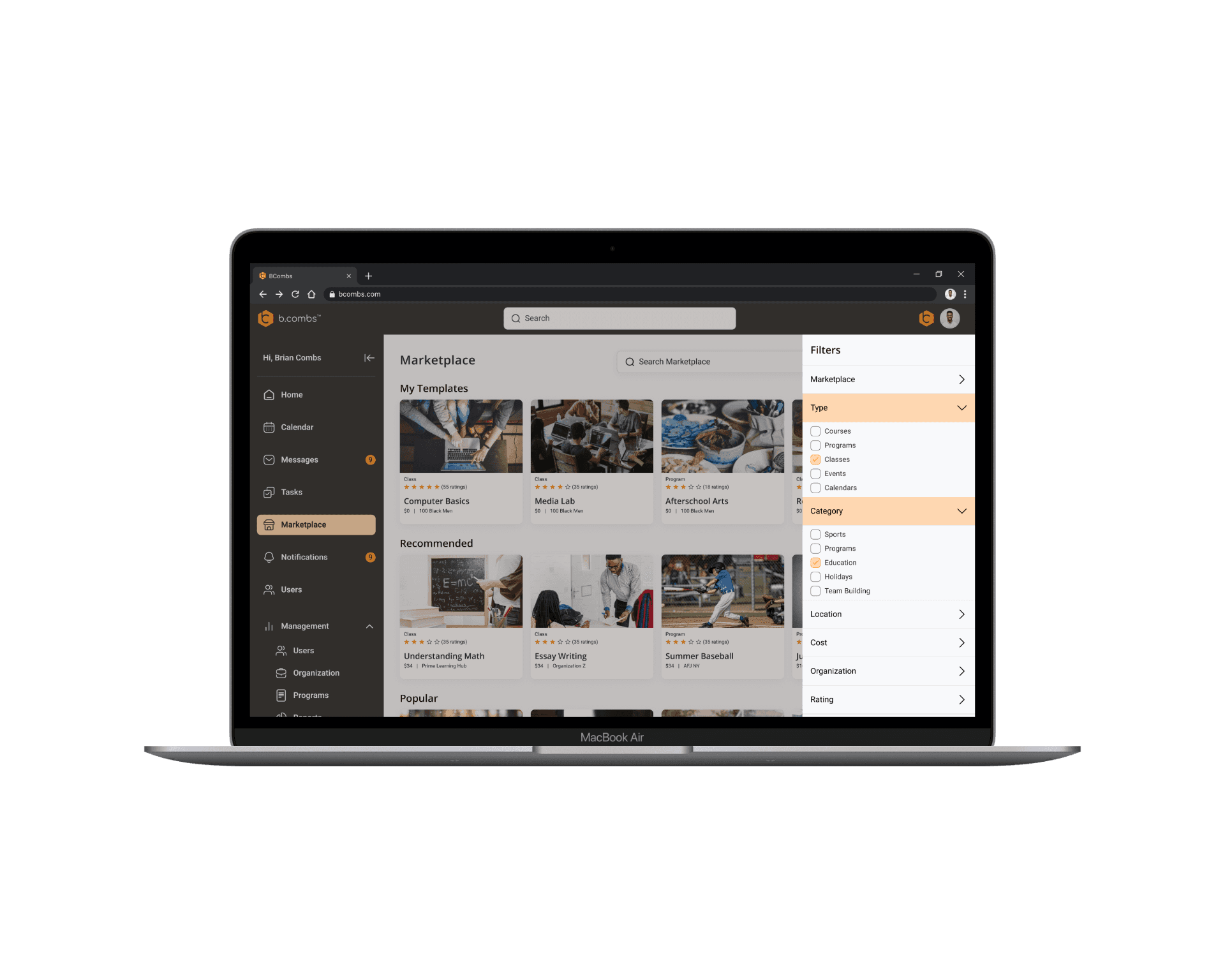
My focus was creating a marketplace for the BCombs community. Through mapping out the user journey in BCombs, I discovered opportunities to consolidate aspects of the user story, reducing the number of screens required and enabling component reuse across multiple flows.
This approach minimizes development efforts, saving costs for the client and enhancing user experience. The user flow creation process enabled me to prioritize effective strategies for the user story and deliver a streamlined solution with the best user experience.
Identifying Core Product Experiences
USER FLOWS
The client outlined a series of comprehensive user stories, serving as the foundation for the development of features within B.Combs
USER FLOW #1
As a Client Admin, I want to document the resources & action steps needed to have a successful program
USER FLOW #2
As a Client Admin, I want to manage my organization's Programs, Courses, Classes & Events
user flow #3
As a Client Admin, I want to use the B.Combs marketplace to share Programs & Courses with other users
user flow #4
As a Client Admin, I want to manage profiles
UI Ideation
HYPOTHESIZING THE DESIGNS
Through mapping out the user journey in B.Combs, I discovered opportunities to consolidate aspects of the user story, reducing the number of screens required and enabling component reuse across multiple flows. This approach minimizes development efforts, saving costs for the client and enhancing user experience. The user flow creation process enabled me to prioritize effective strategies for the user story and deliver a streamlined solution with the best user experience.
idea exploration

Identifying the Types of Marketplace
PRODUCT USE CASES
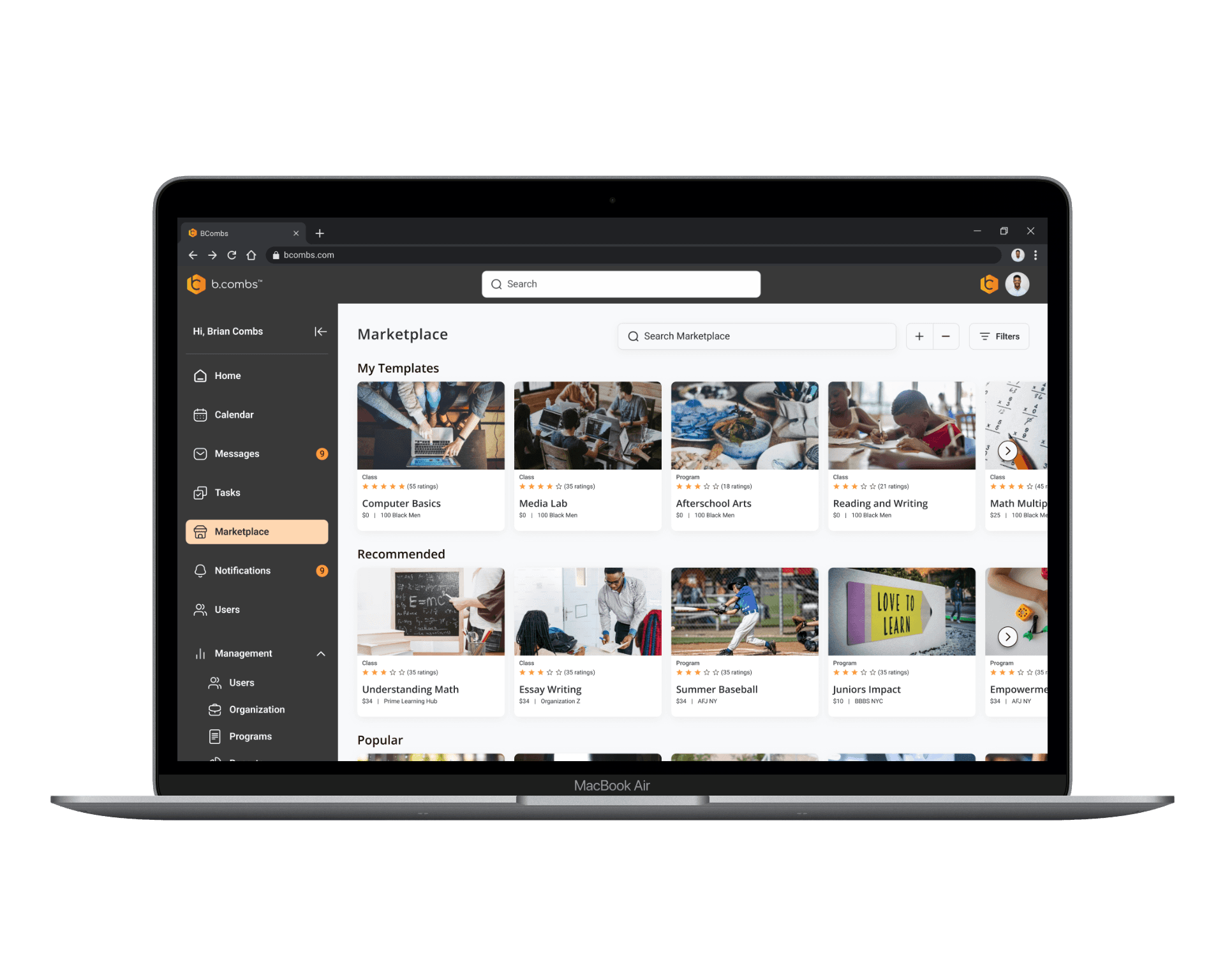
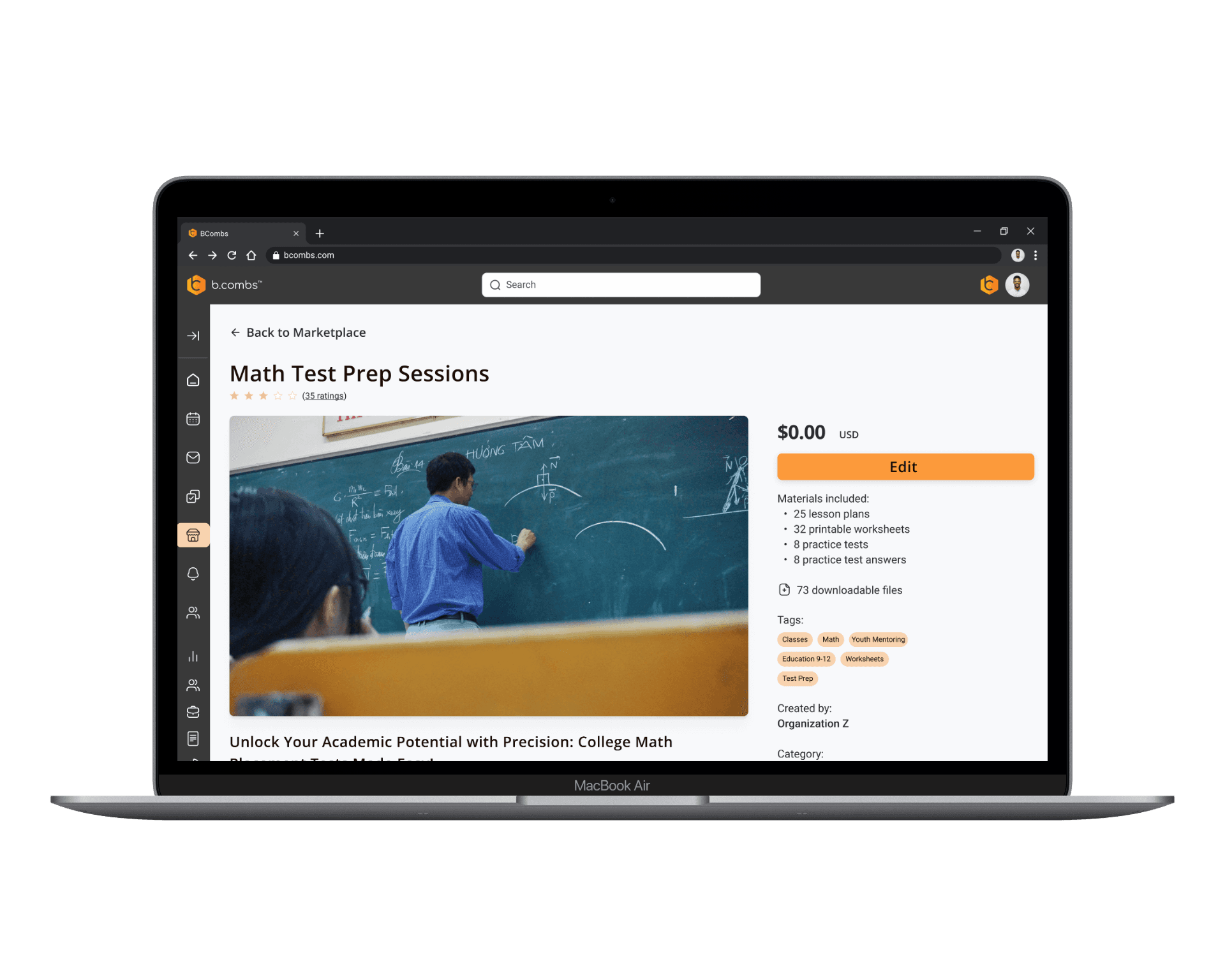
Next, to probe into how the marketplace will fit into the B.Combs CRM platform specifically for the organizations, I brainstormed different types of marketplaces ranging from Facebook marketplace to online course catalogs to event ticketing sites like Stubhub and Dice.fm.
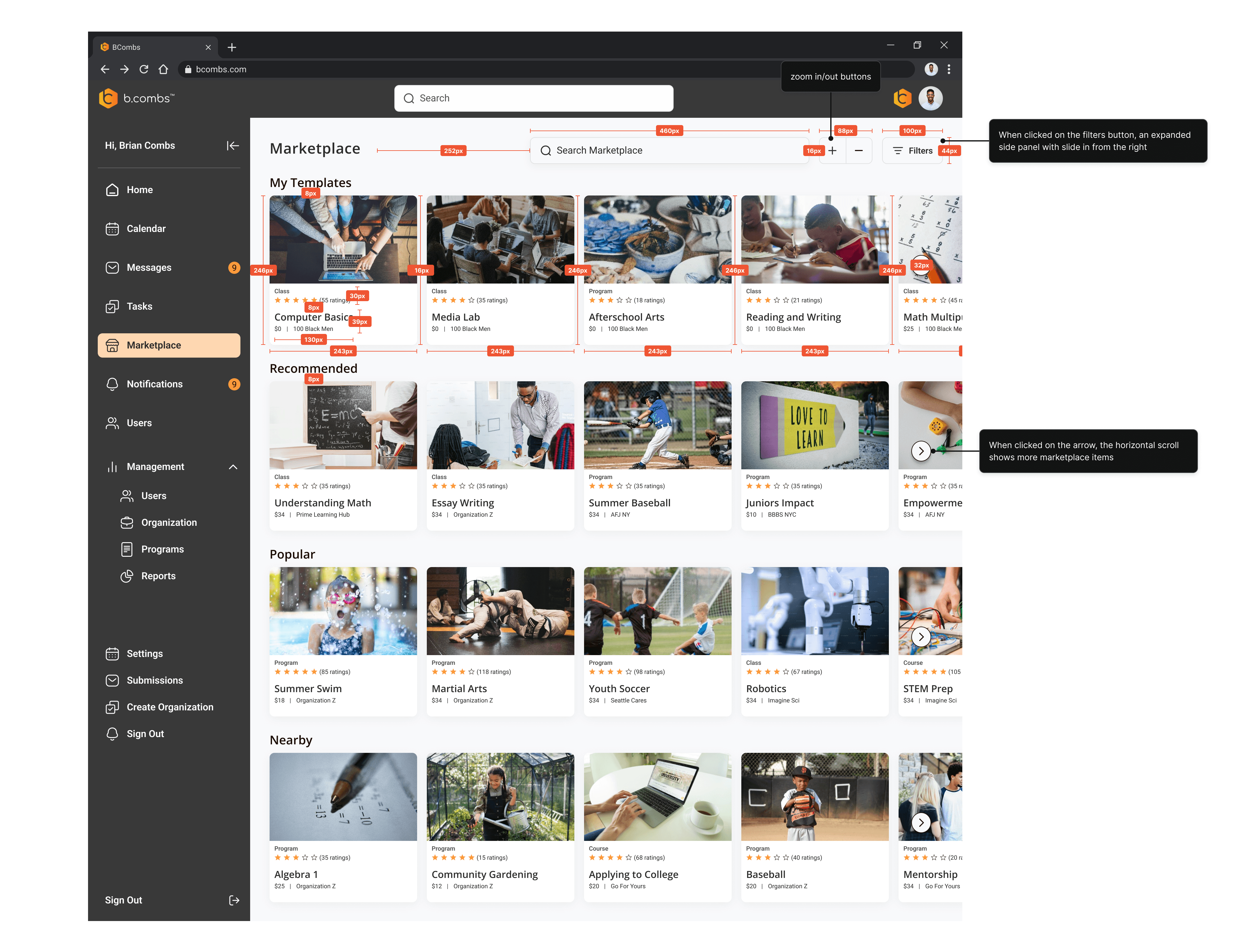
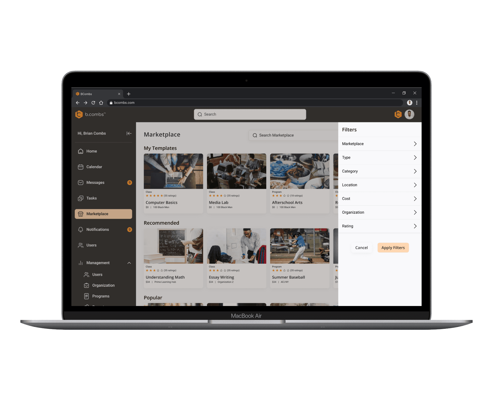
FILTERS
With extended filter options the users can easily seek out their preferences.
,
HORIZONTAL CAROSELS
Easy for organizations to view the marketplace items
style
Boxes that incapsulate preview of the marketplace item and costs.
Building out the Marketplace
Wireframes
Following four rounds of rigorous internal refinement, we presented our polished med-fidelity wireframes to the client. This collaborative review served as a critical alignment checkpoint, ensuring our design vision resonated with the client's goals before advancing to high-fidelity development. This milestone not only marks significant project progress but also underscores our commitment to precision and client satisfaction in crafting an exceptional digital solution.
MED FIDELITY SCREENS
Following four rounds of rigorous internal refinement, we presented our polished med-fidelity wireframes to the client. This collaborative review served as a critical alignment checkpoint, ensuring our design vision resonated with the client's goals before advancing to high-fidelity development. This milestone not only marks significant project progress but also underscores our commitment to precision and client satisfaction in crafting an exceptional digital solution.
STYLE GUIDE
We revamped the style guide created in previous phases, emphasizing functionality and user-friendliness to better support future designers. Building on existing components and guidelines, we introduced new icons, typefaces, and colors. Our efforts also included designing new components and refining existing ones to ensure a cohesive and seamless experience. A notable improvement was the redesign of the side navigation bar, enhancing its expandability and usability significantly.
Hi FIDELITY SCREENS
In this crucial phase, I took meticulous care to ensure that our user interface surpassed both client and user expectations, all the while harmonizing seamlessly with BCombs' branding aesthetics.
In response to client feedback, I made specific updates to existing UI elements, resulting in the following adjustments:
• Introduced a hover feature for Marketplace items, enabling users to save and share them with others seamlessly.
• Incorporated a zoom-in/out functionality into the top right navigation, enhancing accessibility for all users.
What's the marketplace?
From the intuitive simplicity of industry giants like Airbnb and Amazon to the specialized offerings of niche platforms, each marketplace offered unique insights and innovative approaches.
I sought to distill the essence of what makes a marketplace successful and translate those principles into actionable strategies for BCombs. This iterative process not only broadened my understanding of marketplace dynamics but also provided valuable guidance for crafting tailored solutions that resonate with BCombs' audience and objectives.
04
DEV HANDOFF
DEV HANDOFF
Before handing off to the developers, I conducted a thorough review of the files, meticulously checking spacing, measurements, and annotations for precision. I also created detailed user flows to clarify any ambiguous steps, ensuring a clear understanding for the developers as they moved into the implementation phase. This careful attention aimed to provide the development team with clear and comprehensive instructions, thereby streamlining the transition from design to development.