

A mobile app for those wanting to lead a more sustainable way of living
Sustain
Project Overview
Addressing climate anxiety through access to an inclusive resource library.
I designed this mobile application to help users discover nearby sustainable resources and develop eco-friendly habits for their daily lives. It provides a comprehensive library of sustainable options and offers reliable information resources on sustainability to promote environmentally conscious living.

PROBLEM
Climate change is a big challenge that we all face, but it can feel overwhelming and hard to tackle in our busy lives. Even though it’s a crucial issue we need to address, many prefer to avoid it due to the difficulties it brings.
Sustain is an app created to simplify sustainability and make it easily accessible to everyone. It addresses climate anxiety and the common challenges of time constraints and affordability that often hinder individuals from embracing sustainable living. With Sustain, users have access to reliable and simple resources that can seamlessly integrate sustainability into their daily routines.
01
DISCOVERY
ROLE
UX/UI Designer
TIMELINE
Feb 2023 - May 2023
SKILLS
Interaction Design
Visual Design
Design Systems
User Research
TOOLS
Figma
Loom
Miro
Zoom
Understanding my audience
During my research, I found that many people trying to maintain a sustainable conscious living to be challenging and overwhelming.
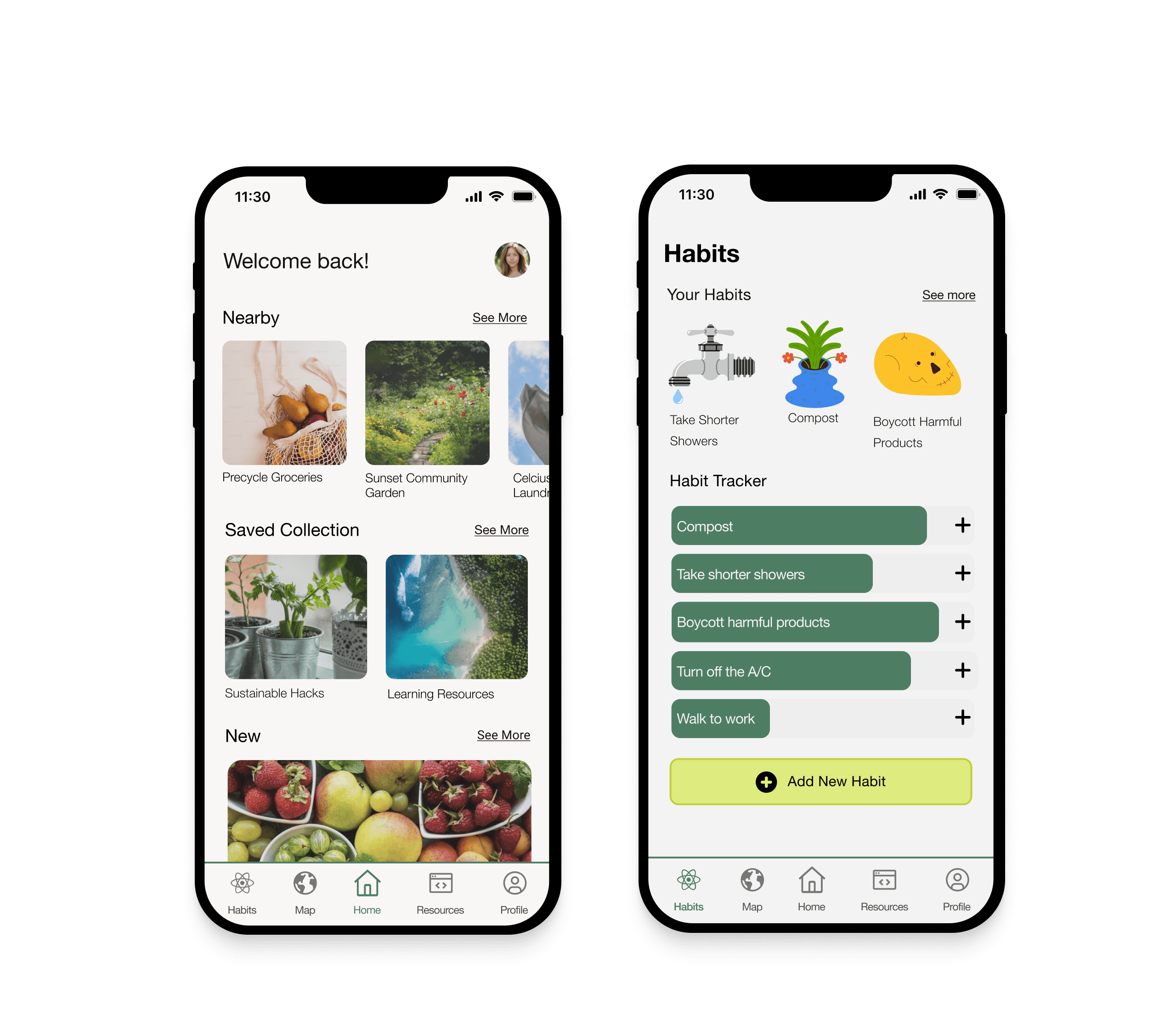
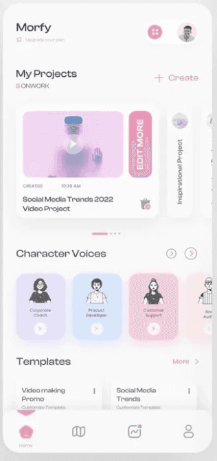
1/ DASHBOARD
Use of bento boxes for organizing information
and emphasis on visually sharing data.
2/ NAVIGATION BAR
The navigation bar contained an extensive collection of tabs that lead to different sections of the CRM, also the collapsing function for simplicity.
3/ STYLE GUIDE
With the preference for the orange color palette, with secondary colors used sparingly as needed. The use of white space around the information.
4/ Components
The current MVP contained the essential foundations of a login flow, home screen, dashboard, style guide

The Goal
I wanted to understand what challenges people faced most when addressing sustainability in their daily lives.
02
IDEATION
Identifying Core Product Experiences
USER STORIES
The client outlined a series of comprehensive user stories, serving as the foundation for the development of features within B.Combs
USER STORY #1
As a user, I want to have all my sustainable resources in one application so that it’s more convenient for me
USER Story #2
As a user, I want to be able to search for where my closest eco options are so that I can utilize them.
user STORY #3
As a user, I want to feel less overwhelmed and have gradual ways to introduce new sustainable habits into my lifestyle so that I feel less overwhelmed
user STORY #4
As a user, I want to learn where my closest compost bin and clothing donation drop off are so that I know where to go
SKETCHING OUT THE WIREFRAMES
After sketching, I created foundational low-fidelity screens with Figma for the app. The sketches guided how the app should look. My initial wireframes were simple, focusing on key features, but I added more details as I went along. This process helped me find better ways to make the app easier to use while looking minimalistic.
INTERVIEWS
I conducted interviews with 5 participants via Zoom to delve deeper into their perspectives and hurdles regarding sustainability. My aim was to grasp the fundamental challenges and barriers in their lifestyles as they strive to be more sustainability-conscious, and to identify individuals who feel they are successfully embracing sustainable practices. Through targeted research questions, I explored their sentiments towards the topic and unearthed their personal narratives and challenges. These participants encompassed both active practitioners of sustainability and those aspiring to adopt sustainable lifestyles, yet grappling with common obstacles such as affordability, accessibility, and mental well-being.
USER FLOWS
I created user flows to visualize how users would navigate the app and complete key tasks. These flows became essential in guiding the design and development process, ensuring intuitive user interactions and seamless task completion.

BRAND + VISUAL IDENTITY
Sustain is a reliable and relatable friend that you can go to when it comes to all things eco.
Inclusive, accessible, knowledgeable, mindful and honest
•The UI Imagery I’ve chosen helps convey the design forward and clean lines for this sustainability app. I want the user to be able to easily navigate their way through the app and focus on the content without getting frustrated or confused.
•The color palette I’ve chosen should feel inviting to the users, softness in the gradients.
•The rounded corners in the layouts makes it easier on the eyes both aesthetically and practical. It provides comfort to the user.
•The UI Imagery above show I feel are ideal examples of how the design guides the user through the app
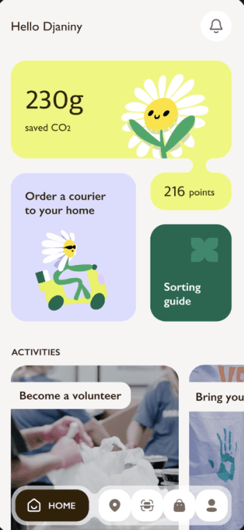
Imagery Inspiration
UI Inspiration

The UI Imagery I’ve chosen helps convey the design forward and clean lines for this sustainability app. I want the user to be able to easily navigate their way through the app and focus on the content without getting frustrated or confused.
The color palette I’ve chosen should feel inviting to the users, softness in the gradients.
The rounded corners in the layouts makes it easier on the eyes both aesthetically and practical. It provides comfort to the user.
The UI Imagery above show I feel are ideal examples of how the design guides the user through the app


I’ve chosen the imagery above to represent Sustain because I feel that these images/ visuals showcase the brand attributes: Inslusive, Accessible, Knowledge, Mindful and Honest.
I also chose the nature imagery to show the vast and expansive knowledge of sustainability. The image of the girl with her arms up and the cotton candy clouds to show the softness and mindfulness I want to carry throughout the app
I want this app to be relatable to the users and with that in mind I consider the design and graphic elements that attract the users visually.


Hi FIDELITY SCREENS
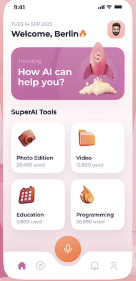
I created many versions of high-fidelity mockups in Figma to fully embody the brand's desired look and feel. I aimed to ensure that the application offered users a seamless, clean and calm experience. I also designed specific components within the app to maximize clarity and usability for all users. I often referred and updated the style guide as I created these Hi-fidelity screens, it was helpful to keep the UI design consistent throughout the app.
03
DESIGN
04
TESTING
05
REDESIGN
06
REFLECTION
User Testing
HOW USERS FOUND THE PROTOTYPE
I conducted usability tests for the application with five participants through Zoom. I asked each participant three distinct tasks to gain insights into their actual usage patterns. These tasks included adding a new recommendation to the map, adding a new habit to the habit tracker, and saving a resource. Their feedback from the interviews was super helpful in identifying areas that required some adjustments to ensure the usability of the app.
🚨
3 USERS
Users had issues saving the resource on the save resource screen
,
⚙️
2 USERS
Couldn't recognize the save icon
🚫
1 user
Difficulties saving the new habit on the add habit page due to not seeing there was more information to be selected
Revision #1
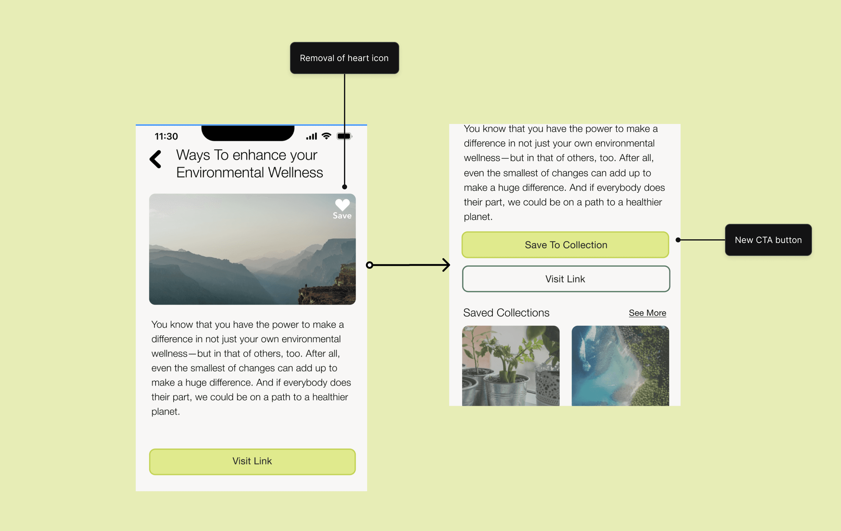
Issue #1: 3 out of the 5 participants had trouble saving the resource on the save resource screen because it’s not clear that the user has to also select a collection folder to save the resource into after clicking on the heart icon.
Solution: I improved the wording for the "Save a Resource" task to clearly instruct users to select the folder where they want to save the resource.
Revision #2
Issue #1: 2 user mentioned that they had difficulties saving the new habit on the add new habit screen. They told me that as they didn’t know they had to scroll down the screen to view the save button.
Solution: In the habits task flow, I added additional content and spacing to ensure that some of it extends beyond the screen. I also replaced the images in the suggestions with illustrations that occupy more space, making the design more consistent across the habit screens.
Revision #3
Issue #1: 1 user had trouble looking for the save button which is a heart labeled on the image, they said they were looking for an actual save button rather than a heart to save it.
Solution: I removed the heart icon to save the article and replaced it with a 'Save To Collection' CTA button.


Reflecting
Reflecting on the journey of designing my first app, the driving force behind its inception was my passionate commitment to sustainable living and my aspiration to ignite similar passions in others. Climate change, an ever-pressing global crisis, often looms as an overwhelming challenge, its complexities deterring many from meaningful action. My aim with this app was not to prescribe radical transformations but rather to illuminate the plethora of simple, sustainable practices that seamlessly meld into our daily lives.
Throughout the design journey, there were moments of doubt. Tackling the multifaceted issue of climate change demanded exhaustive research, inventive problem-solving, and unwavering perseverance. The vastness of the subject matter posed the challenge of distilling the most relevant elements for inclusion in the app. As someone navigating the landscape of neuro-divergence, I encountered distinct challenges during the project's more demanding phases. Designing an app tested my resilience, requiring unwavering focus and meticulous attention to detail. Yet, amidst these trials, my dedication to the vision remained steadfast.